LOGO DESIGN & BRAND DIRECTION
“Supporting your reemergence.”
Teresa Taylor Services
- Individual Life Coaching
- Speaking Engagements
- Workshops
- Group Coaching
- Legal Nurse Consulting
- Health Care Education
Supporting Teresa to have ease in this decision-making process was my goal throughout. I was able to present Teresa with something she hadn’t yet explored or seen as a possibility. My job is to push the client a bit further into something they haven’t yet seen or explored, when they are willing. It doesn’t always pay off, but in this case it did.
Getting to Know Teresa, and Her Business
Teresa and I have known each other for years through friends and local biking events. This winter, we met over hot drinks at a cozy local cafe. We met to discuss our new endeavors; mine as full-time, independent designer and illustrator, and hers as a coach and advisor. The coincidences were beautiful; each of us had built decades of experience in our respective fields, and each of us recently decided to go for it!
As our conversation wound through topics that we shared in common — the opportunity to slow down, the exhilarating and scary parts of trying something new, the fear of failure, and, of course, all things parenting — Teresa mentioned she needed a logo for her soon-to-launch coaching and consulting business, and asked if I could help. I was happy to oblige!
Working on The Brand
After a couple of meetings, a very long questionnaire (I like to be thorough!), and building a shared vision board, we had a plan.
She already knew how she wanted her brand to look and feel. She provided me with some examples that gave me a very clear idea of the style she desired: minimal, soft, warm, soothing, and natural style with an essence of curiosity. Something that symbolized being held, and a transformational unfolding.
There’s a pressure, as designers, to hit the nail on the head the first go. There’s also this tendency (at least for me) to try to encompass ALL of client requests, but what typically works best and reigns supreme for designing a brand is to hone in and simplify. Lucky for me minimalism was on Teresa’s request list!
For this project, it was important to really get to know Teresa better, since she is her business. It was also important to understand who she was going to be coaching.
Teresa knew that she was going to mostly be supporting women who were likely already feeling overwhelmed, and going through a BIG identity shift, either a major life event, and/or a major loss.
While getting to know Teresa’s style of coaching and her clientele, I was able to pick up on some things that set her apart from the examples of other coaching websites she shared with me. And these very things were going to be what I used to incorporate in the design for her.
When I got to sketching, what resulted was something outside of what we both expected. I love when this surprise happens! It usually comes when there is a combination of a mutual trust, a clear understanding of what the client wants, and the freedom to experiment and expand on their vision. It is such a gift when these ingredients come together and for me to be trusted to take the design to a place that hadn’t been previously imagined.
Finally, it was time to show her the drafts. After a brief discussion over coffee, it was obvious there was a favorite amongst the three options I presented. A few minor font treatments and we were set!
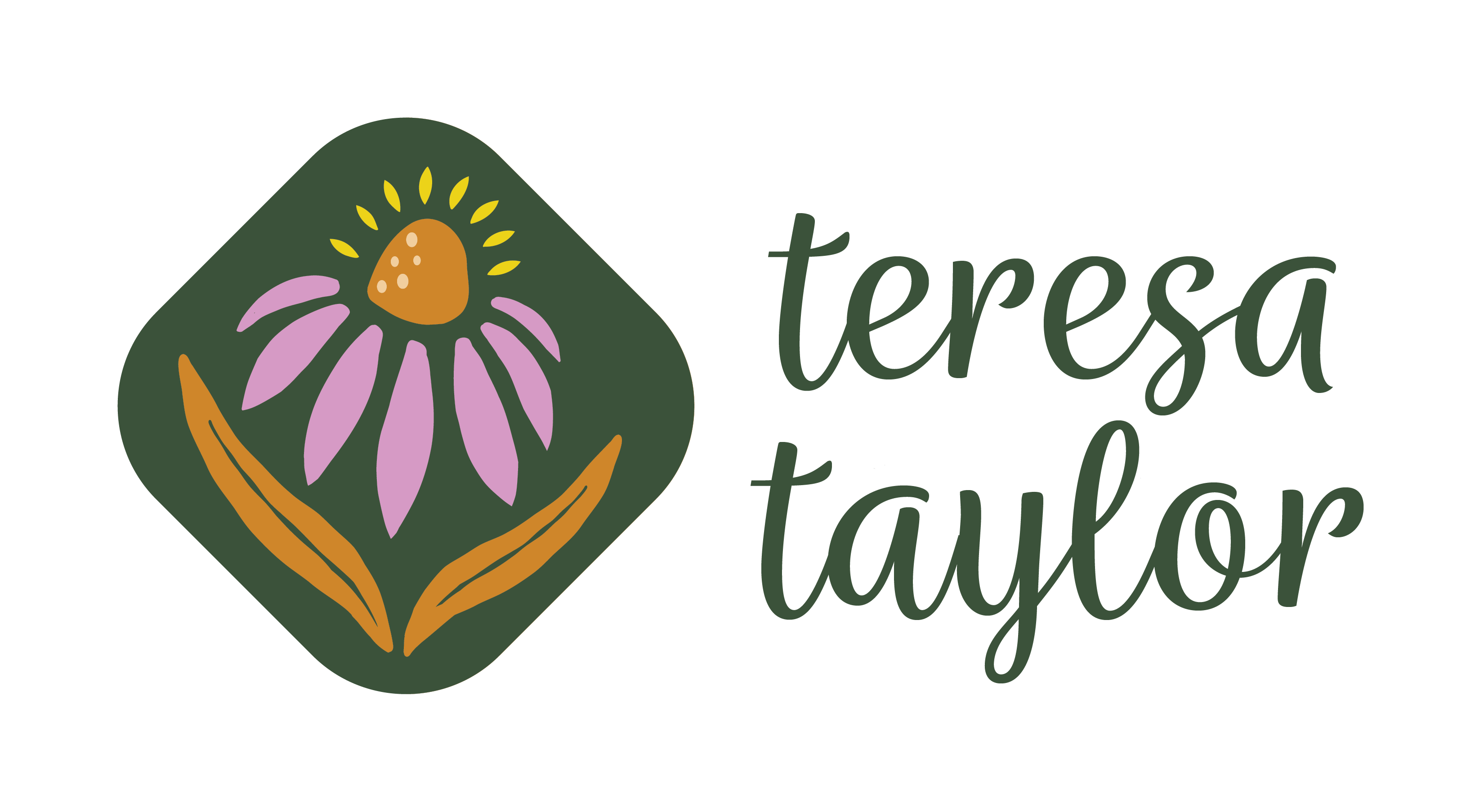
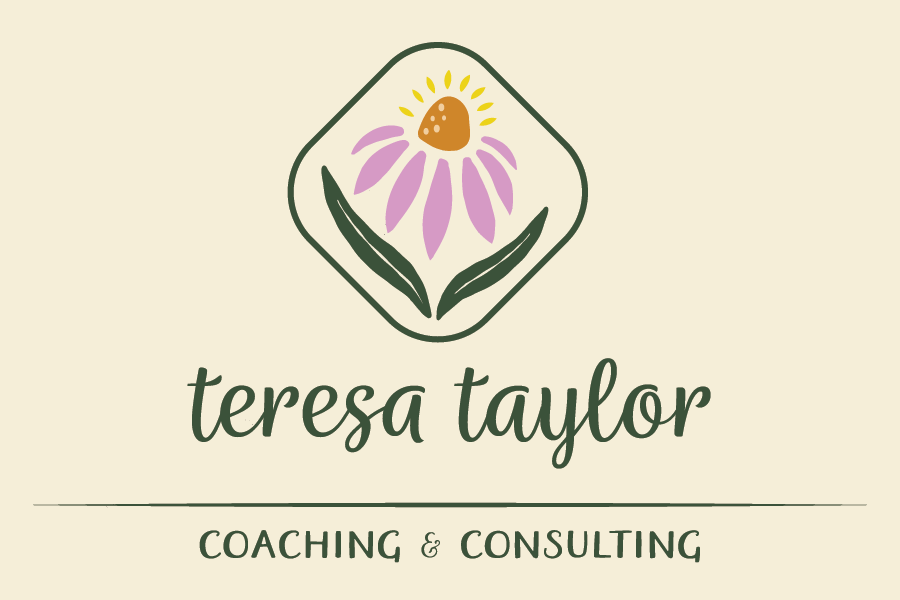
The result is a brand with the themes of growth, transformation, support, staying grounded, playfulness, hopefulness, imperfection, wildness and magic — a bright, emerging echinacea flower blossoming out of two unfolding leaves.
In addition to the one-page branding style guide I presented her, I also gave content recommendations for messaging, photos and images to use on her website as well as a website edit once it was created.
It was a delight to work on this project with Teresa and to learn about coaching. I’m so pleased to have had the opportunity to bring our vision to life, and provide a design that reflects her style and one she loves.
Now, go book your appointment! talk-with-teresa.com